
I promise this will be the last post about the colour options for my Strokkur by Ysolda Teague.
Hopefully, you’re enjoying it as much as I am?
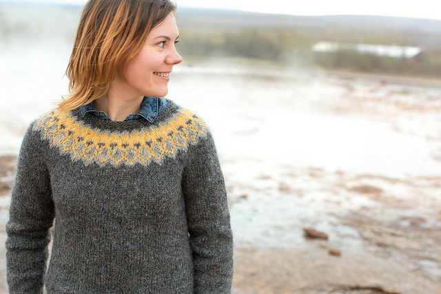
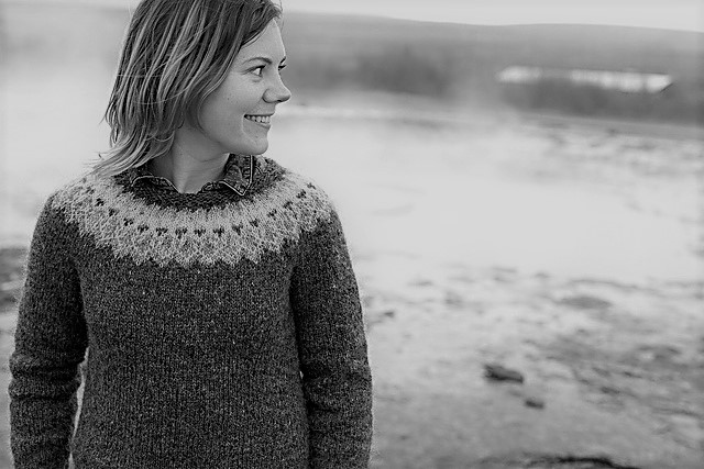
If you look at the colour combination Ysolda has used for her sample garment, you can see that the yellow and the light grey are actually quite similar in tone. There isn’t a great deal of contrast between them, which is much easier to see, if I make the photo black and white.
Supposedly, when selecting colours for any colourwork project, it’s always best to go with a high contrast combination.


You can see the colourwork much better in these garments because there is a greater contrast between the colours.
If I follow this train of thought, I should use the colour combination with the most contrast?
So…..
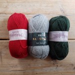
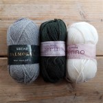
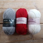
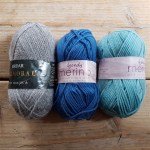
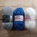
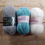
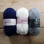
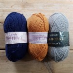
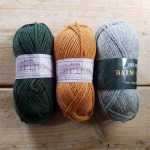
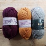
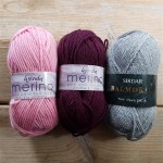
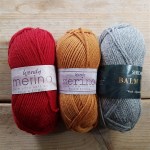
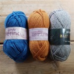
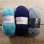
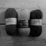
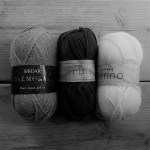
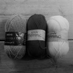
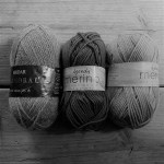
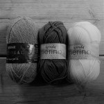
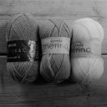
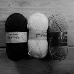
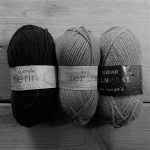
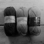
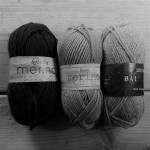
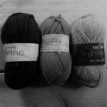
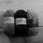
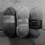
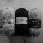
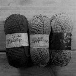
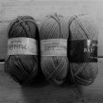
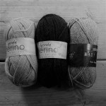
These are the options, all 18 of the damn things. I’ve included a few extra colour combinations, taking shades from all ten balls of yarn.

If you look at the same colour combinations in black and white then the following have the highest contrast.
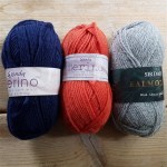
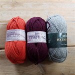
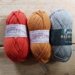
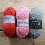
From the top
1st row – 2nd and 3rd photos. I like both colour combinations, but the red and ivory is probably a tad too Christmas. The forest green and ivory are a good possibility though.
2nd row – 1st and 3rd photos. Both the peacock blue and ivory and the navy and ivory, would already have made my list of possibilities anyway.
3rd row – 3rd and 4th photos. This surprised me, but I’m not sure I love either the navy and orange, or the orange and maroon combinations.
4th row – 3rd photo. If I were more of a pink girl, this would have been my first choice. The pink and maroon look great with the grey and make a classic combination.
5th row- 2nd photo. No prizes for guessing that this pairing, was always going to be one of my favourites.
Has this changed your mind? Would you still pick your original colour combination?
I can’t say I’m any the wiser, even after looking at the colours this way. I have definitely disregarded some of the colours now, so I guess I will either have to swatch or live dangerously and just ‘wing it’.
Happy Making

[…] Selecting colours with a high contrast will give the best results. More detail about why can be found in a post Lora recently about choosing shades for colourwork over on her blog. […]